 LinkedIn
Hello World, we've (re) arrived! And this time, we're doing it in style. We've been on an innovation spree for a very long time, and we thought now was the right time to refresh, re-invent, re-organize, and re-discover. But in the midst of this brand-new aura, we're still holding our core values and beliefs close to our hearts, our unshaken aspirations of solving the last mile problem in data science and giving our clients an experience beyond possible.?
Staying true to our differentiator of solving the last mile problem, it was important to ensure our visual identity reflects the firm we are today and the direction we’re heading towards. So, buckle up and read our brand journey, the transitioning from connecting the dots to….let’s keep it a secret for a brief little while, read along to find out.
(Drumroll) Presenting our new brand identity
We've adopted a refreshed design system, a set of elements to establish our new identity. Our logo, brand colors, font, and icons are a part of these elements and are aligned to reflect our aspirational values. These elements are unique to us and help us represent a strong brand image. Here's our new visual language.
Our (super) hero is our 'T,' and it has a back-story
Our new logomark is a timeless piece of design, it's designed to emote strength and confidence, and if you closely notice, the new 'T' is designed with a 60-degree angled cut, not just any design element, it’s to pay homage and carry forward the legacy of our old logo.?
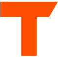
We have also ensured our logo is dynamic, this is to represent the dynamic nature of client issues that we solve using data science. Being customer-centric has always been our core value and this dynamic representation reflects our strong nature of giving customers beyond what they expect, always going the extra-mile, every single time and exposing a world of possibilities to our clients.
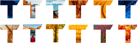
We’ve also enabled our new logo to be represented as an extended form; synonymous with our nature of offering holistic Data Science Solutions for real-world client issues by bridging the gap between insight creation & value realization, pushing the boundaries of what’s possible.
Our new tagline - Beyond Possible
Our tagline is the summation of our brand purpose, a belief in always doing more. It’s about doing what no one else dares to do. It’s a promise to reach our true potential. It’s a belief in going beyond what is considered possible.
Beyond possible is the right podium, the right platform for us to reflect our passion for helping our customers unleash the potential of data science in their respective industries.
Beyond possible perfectly describes our ambition, our identity, and the kind of work we do today. Our team goes beyond just providing insights. We go beyond incremental changes. We enable large-scale transformation and set our customers for accelerated growth.
This new visual identity is a great way for us to express our values in today's context. It reflects our aspirations to differentiate in this world of transformation.
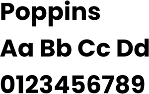
We’re popping Poppins
Great content is meaningless if not presented well. We've chosen Poppins as our primary font to communicate our strong identity differentiating from the crowd. Our singular tone of voice is consistent and appeals to our audiences to build long-term advocacy.
Orange, Green, and Teal - The new us
Orange is our happy color; we have retained our legacy, complementing it with green and teal. Why orange, green, and teal, you ask? We feel orange is the right representation of our differentiators; it's bright, vivid, and stands out, just like how we stand out among our peers, and green and teal signifies growth and an analytical mindset.
Watch our new brand video
Our founders have a few words to say about the new identity and brand strategy
“Over the past few years, our business has transformed radically, presenting the ideal time and opportunity to enhance our marketing strategy.?‘Beyond possible’?perfectly encapsulates our aspirations, spirit, and current work, which extends beyond delivering just insights or making incremental adjustments. It resonates with our purpose of empowering decisions to help our clients win and prepare them for rapid growth. It’s a change towards going the extra mile, enabling our clients to see the forest and not just the trees,”?said Shub Bhowmick, Chief Executive Officer and Co-founder of Tredence.
“Our ability to adapt, innovate and transform is at the core of who we are. A beginner’s mindset while solving some of the most complex problems helps us expand clients’ vision for transformation. For us, the customer is not just our client sponsor but also the end-user at the frontline of our client’s business. We're building a comprehensive identity together behind one vision and one strategy focused on growth for clients and ourselves, and Beyond Possible perfectly reflects this futuristic mindset,” said Shashank Dubey, Chief Revenue Officer & Co-founder
“Beyond possible is the right podium and the right platform for us to reflect our passion for helping our customers unleash the potential of data science in their respective industries,” added Sumit Mehra, Chief Technology Officer and Co-founder of Tredence.?“It perfectly describes our ambition, our identity and the kind of work we do today. We go beyond incremental changes. We enable large-scale transformation and set our customers up for accelerated growth.”
It is critical to adopt a brand identity that connects with our deep self in order to give significance to all we do. Something with which we'd like to be associated. Something that is a natural extension of who we are.
As we re-discover our identity, we will double down on our DNA – as enablers of last-mile adoption of analytics - that remains relevant and differentiating as ever. This DNA anchors us and pushes our ecosystem to go beyond possible to deliver real business impact.
Our aspirations of adopting this new brand identity is to be motivated to dream big and go above and beyond while producing data science solutions for our clients.
Join us as we dream big and test the limits of what's possible.
Let's dedicate, design, and deliver as a team.
Let’s go #BeyondPossible.

